Zydus Wellness Reveals New Brand Identity Emphasizing Science and Empathy
Written by Sirish Dixit
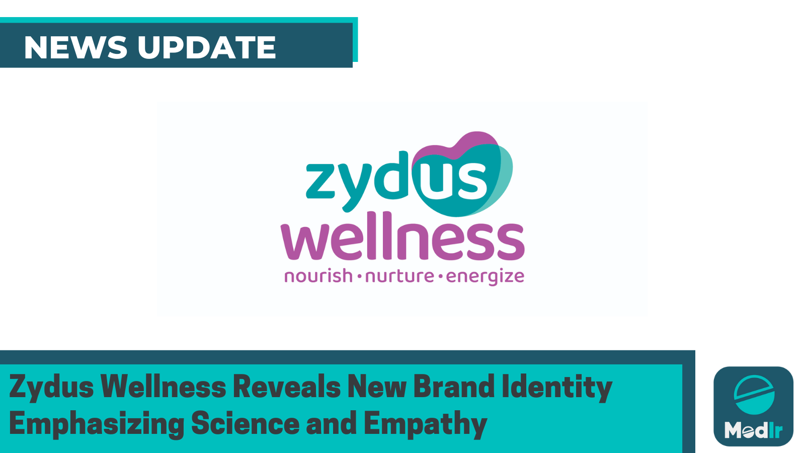
Zydus Wellness introduces a bold new identity that merges science and empathy. With a dual-toned visual theme, it marks a shift toward inclusive wellness and deeper community impact through innovation and compassion.
Zydus Wellness has introduced a refreshed corporate brand identity, marking a significant milestone in its journey of transformation. The new identity reflects the company's deep-rooted commitment to scientific innovation, compassion, and community impact.
The rebranding emphasizes a consumer-first approach, blending scientific rigor with empathy to create wellness solutions that are inclusive, trustworthy, and future-ready. Central to this evolution is the concept of "us"—a collective promise to grow meaningfully with all stakeholders connected to the brand.
The redesigned visual identity features a dual-toned color scheme of teal and purple. The teal heart, symbolizing the consumer, represents science, clarity, and trust—the pillars of the company’s product innovation. In contrast, the purple heart stands for warmth, inclusiveness, and human connection. Together, these colors create a ripple effect that signifies the brand’s mission to nurture and energize lives and communities.
CEO and Whole-Time Director Tarun Arora highlighted that this transformation is more than aesthetic—it underscores Zydus Wellness’ dedication to evolving with the wellness industry, expanding its science-led offerings, and focusing on digital and sustainable innovation.
In financial terms, Zydus Wellness posted a 16.2% increase in consolidated net sales for FY25, reaching Rs 2,691.2 crore. Net profit grew by 30% to Rs 341 crore, while EBITDA rose by 23.2% to Rs 379.7 crore, signaling strong performance aligned with the company’s renewed vision.